
Assignment 1: Design Evaluation Exercise
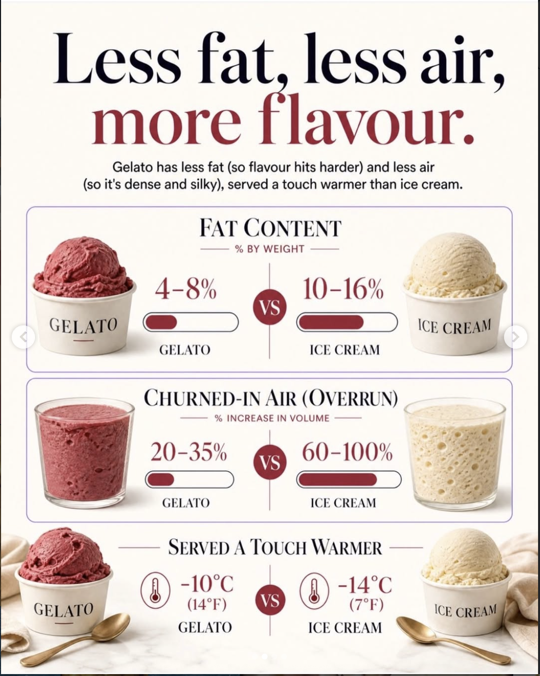
This infographic was posted on Instagram by Paulo Gelato & Chocolate, a small dessert shop in Chicago. The shop describes its gelato as “hand-crafted” and “natural,” emphasizing a sophisticated, elegant image. The intended audience of this graphic is people who like ice cream and people who enjoy healthy food options. This could intersect with individuals on a diet, or athletes following a meal plan, or simply consumers who like frozen desserts. The first piece of this graphic to catch my attention was the headline text at the top. Because it is a larger font, it appears bolder than the rest of the text, which makes it stand out. The red of the second line serves as a contrast to further draw the eye. This design reads top to bottom, with the headlines serving as the starting point. The second line of the text is the same color as the other graphics, guiding the eye down the image. The continuity of color in this post makes it easier to read because the design presents a solid line down the middle for the eyes to follow. The design is telling the viewer that gelato is a healthier dessert option than ice cream. It communicates this information by explaining the reasons behind their claim (low fat, more product per serving, more flavor). Then it presents statistics to add credibility to its claim, showing how gelato outperforms ice cream across various categories. This graphic creates confidence in the company’s authority by making an assertive claim rather than posing a question. The serif font and muted color palette used also emphasize the company's sense of sophistication, encouraging viewers to try their elevated version of ice cream. One thing I would improve about this design is the images, as they look too artificial and may mislead some consumers.