
Assignment 7: Social Media Designs


Design Rationale
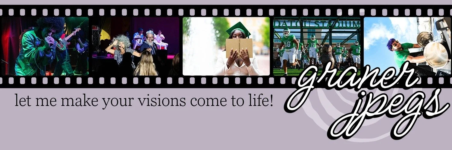
I chose to use my own brand for this assignment, since I have been working on streamlining my socials to fit better with my website. The main color palette of my website is white, black, and lavender, so those three were the colors I had to work with. As a photographer, I believe the best way to advertise yourself is to show what you can do. All visual elements in these designs are my own images. For the Facebook story design, I tried to focus on readability and how to draw attention, since stories are most often skipped through with little focus. I used a vivid color picked from the image used in the design to draw attention to the most important information. I put the most information about me and my brand on the LinkedIn header, as that is where most business-related information is exchanged. I also included contact information on the header because LinkedIn does not have an easily accessible place for contact information. The design is meant to show examples of my work, but as design elements rather than information. The Twitter header flips this design hierarchy. The images are part of the information shared with viewers, complemented by the brand name and tagline. Twitter has other places to provide contact information, so it wasn’t as necessary to cram it into an already small design. My logo is included in the Facebook design, but I chose to incorporate the spiral of the logo in more subtle ways for the other two designs.