Assignment 4: Ad Redesign Exercise
ORIGINAL DESIGN
MY REDESIGN
Rationale
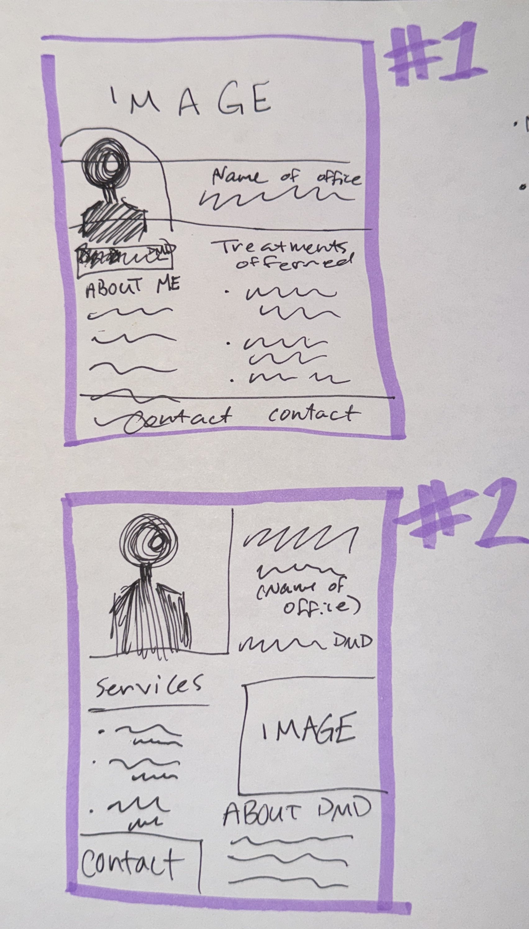
I changed the original design in a couple of different ways. First, I added a stock image of a child at the dentist to better communicate the intended audience for the advertisement. I rearranged the information for easier readability, such as using subheads and font variation. I also removed one of the previously included sentences, since it felt redundant and took up needed space in the design. I utilized the WET layout principles of visual hierarchy, gutters, headlines, and font variation. My headlines were in Futura, a sans serif font, to appear bolder and more eye-catching on the page. The body text is Marion, a serif font, as our eyes are most used to serifs as a small body font. My design breaks up the information in a way that is easier to follow. Each column includes an image, headline, copy, and an extra module of information, rather than a wall of text. My layout is more effective for the intended audience because it is easy to read and quickly grabs the most important information.
Designer Reflection
The intended audience of this advertisement is parents in Madison County seeking pediatric dental services. This audience typically is working and needs easy-to-read graphics that don’t take long to understand. With more time, I would have made the design a bit more dynamic and creative.
External resources: Shutterstock.com