
Assignment 3: WET Layout and Layout Sins
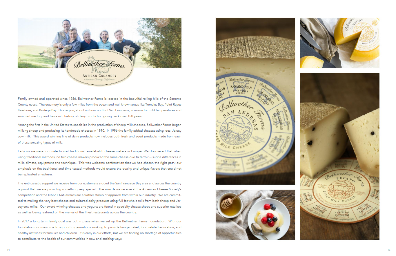
Chefs’ Warehouse Cheese Catalog 2020, pg. 14-15
What is the first thing your eye notices?
The first thing my eye notices in this spread is the photo grid on the right. It utilizes visually interesting textures and colors to catch the eye, then leads the viewer to the story on the left.
How does the design guide the viewer through the content?
The placement of the labels in the layout seems strategic, leading the eye from image to copy and vice versa. The brand logo is pictured in the upper third of the left page and both the middle and lower thirds of the right page. There is only one logo per layout column, which adds to the distinction.
What role does hierarchy play in the layout?
The images, which are the attention-grabbers, take up the most space in the layout. There is no traditional headline, but the logo of the company serves the same purpose in this layout. It is smaller than the other photo elements and explains the copy included below.
How is white space used?
Evenly divides the page between farmer focus and ingredient focus. Gives the images room to breathe while still showing continuity.
What information is emphasized?
The appearance of the products and the people who make them.
Why do you believe this design is effective?
It is a simplistic way to grab a viewer's attention and lead them into new information. This design was consistent throughout the catalog, making it a reliable way to convey varying information to an audience.
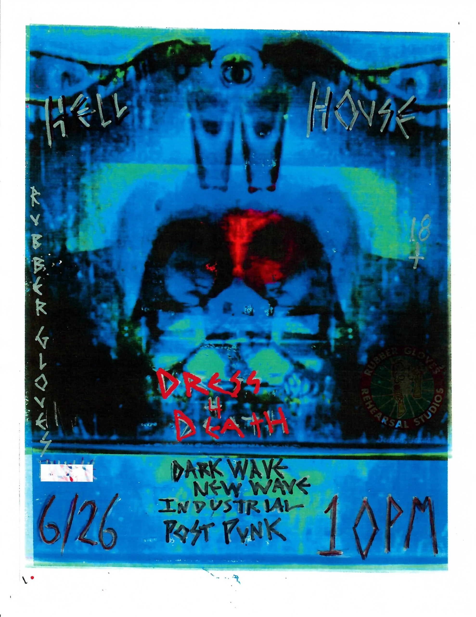
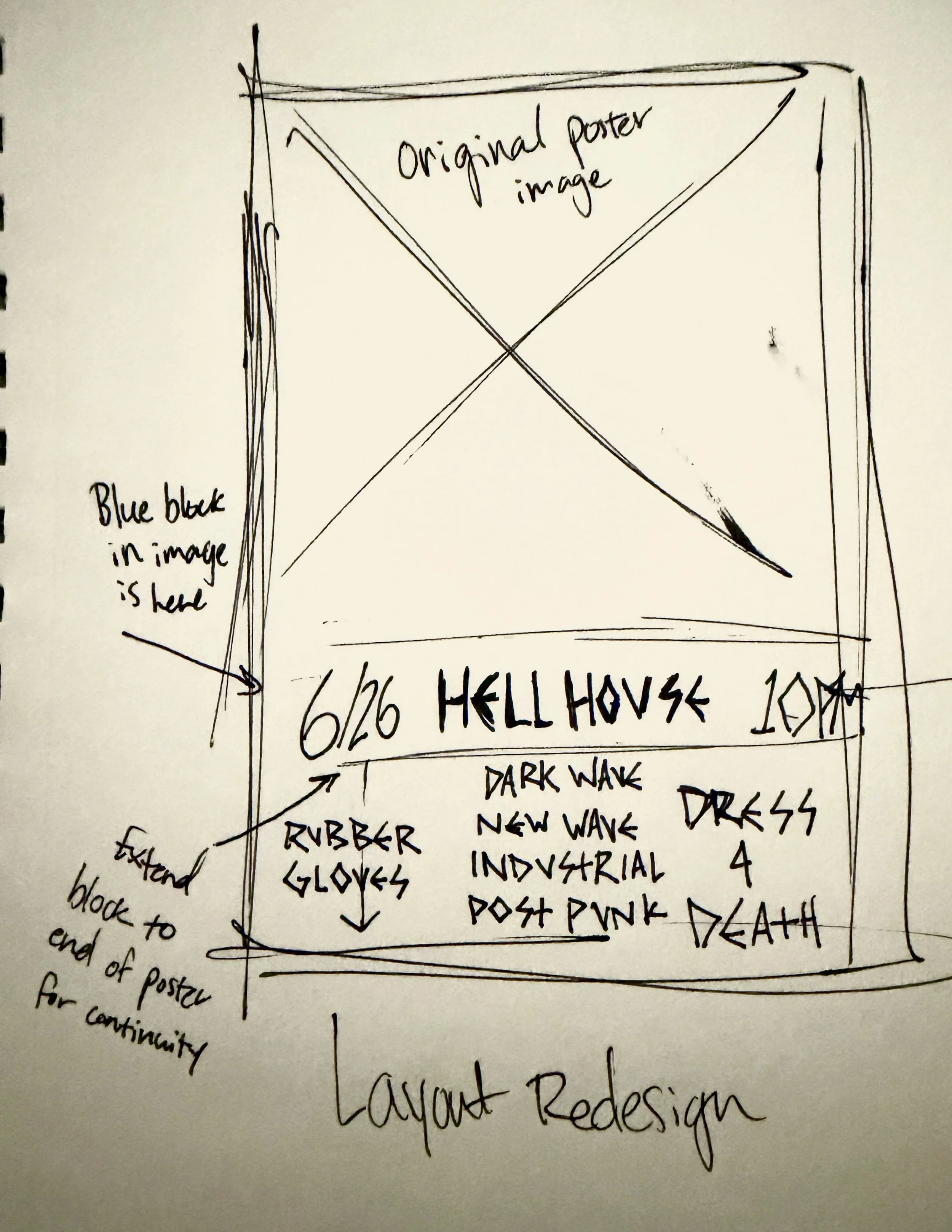
Layout Sins Redesign of a Rubber Gloves Rehearsal Studios event poster
Issues
Clutter
Tacky type emphasis
Lack of alignment
Missing margins
Busy background
Reflection
In the original design, the thin, multicolored text was hard to read against a busy background, making some of the information illegible. The new design moves the text lower on the poster to a more visible area, ensuring greater readability for more viewers. In my redesign, I focused on column spacing and visual hierarchy. The text has more important information than the image, so it should stand out more in the design.